Brand
Scripe brand guidelines
Everything you need to show Scripe the way we do: the logo, the mark, the app icon and our colours.
ZIP, 2 MB · SVG and PNG
Naming
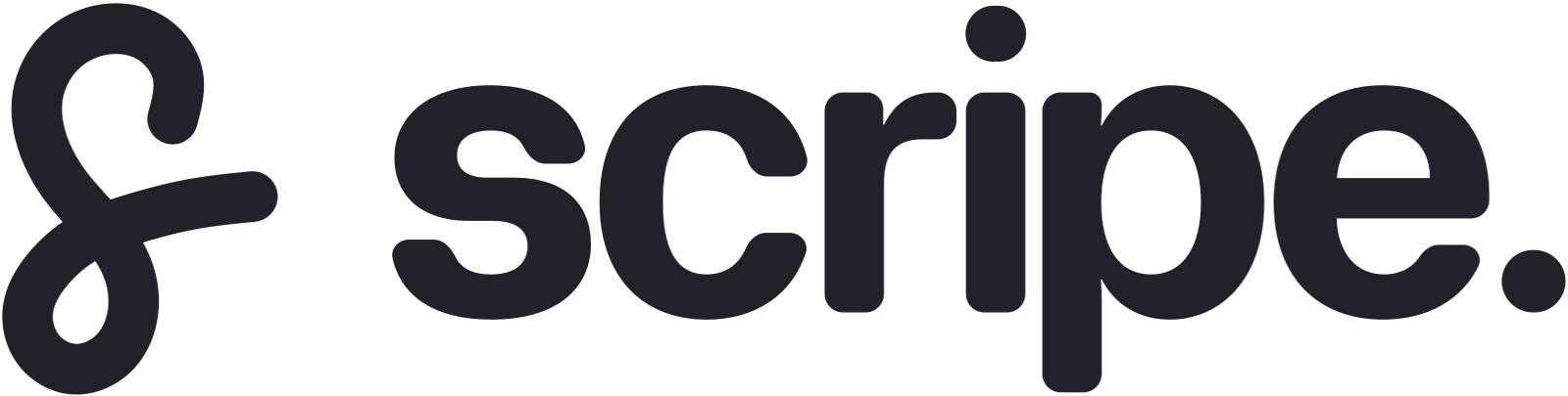
“Scripe” is one word with a capital S. It is the name of our company and of our product, so write Scripe, not “Scripe app” or “SCRIPE”. The logo sets it in lowercase with a full stop, “scripe.”, and that spelling belongs to the logo alone. Our legal name is Scripe GmbH.
Usage
Give the logo room: keep at least the height of its lowercase letters free on every side. It is always one colour, Ink on light backgrounds and Paper on dark ones, and never smaller than 16 px tall on screen or 5 mm in print. Below that, use the mark.
Please don’t
- Fill the logo or the S with a gradient or with any colour other than Ink or Paper.
- Stretch, rotate or outline the logo, or give it a shadow.
- Retype “scripe.” in a font or redraw the S. Use the files.
- Put the Ink logo on a dark or busy background. Use the Paper version, or a calm area of the picture.
Logo
The S and the word “scripe.” together. Use it wherever Scripe is named and there is room for it.


Mark
The S on its own, for tight spaces and rows of logos. The full logo is easier to recognise, so use the mark where Scripe is already named nearby or the word doesn’t fit.

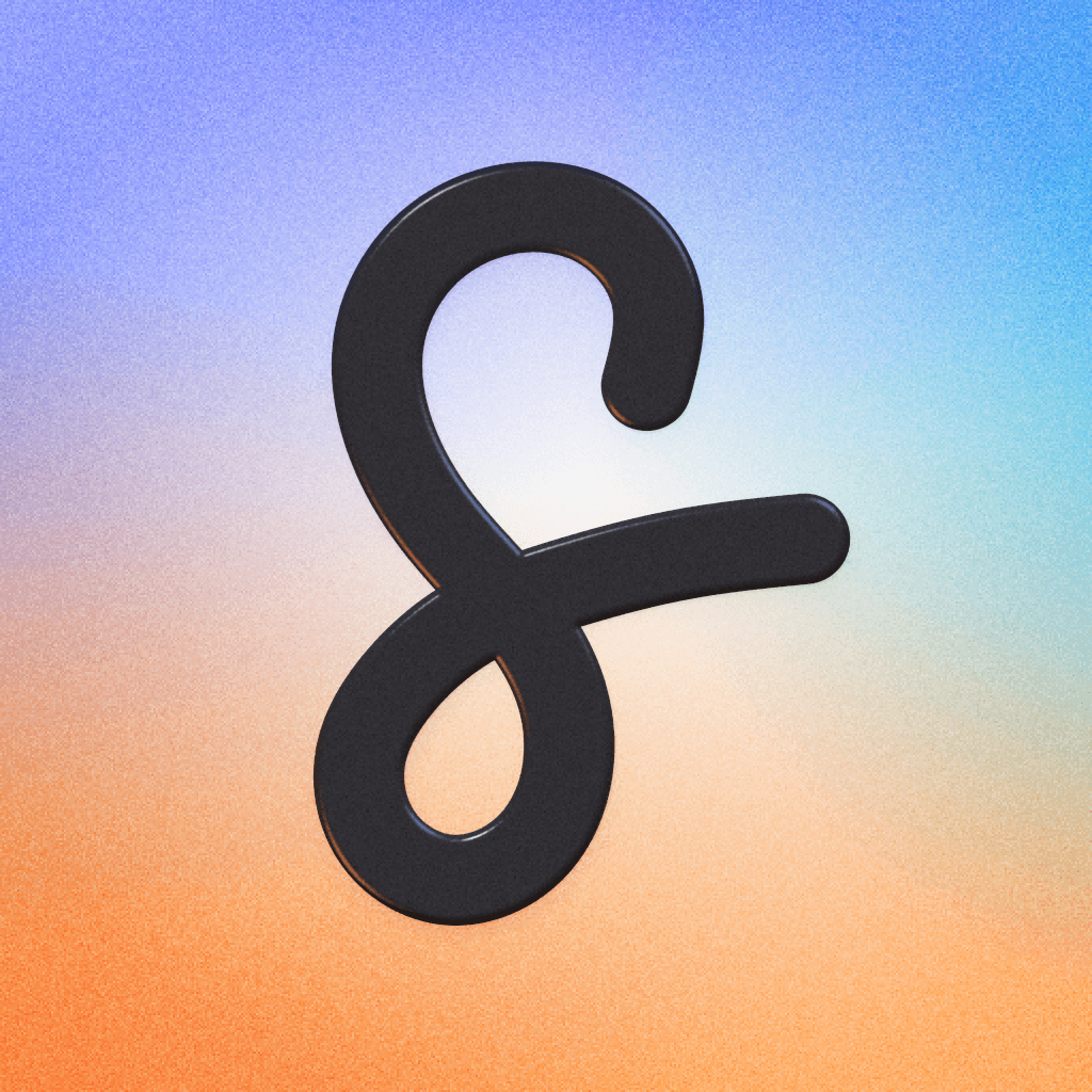
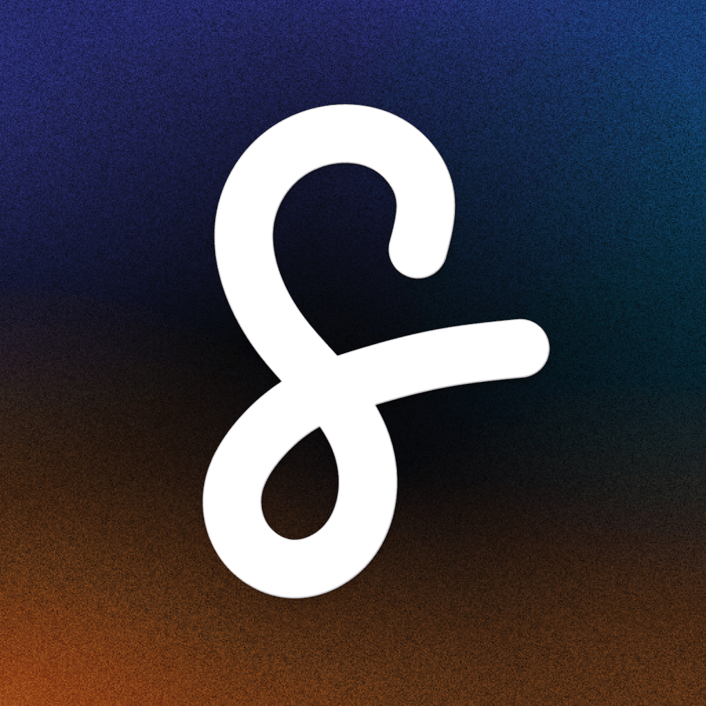
App icon
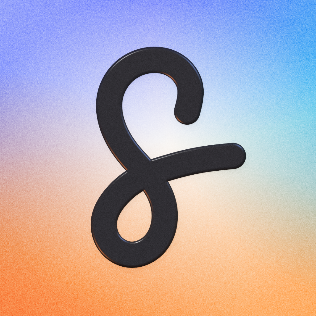
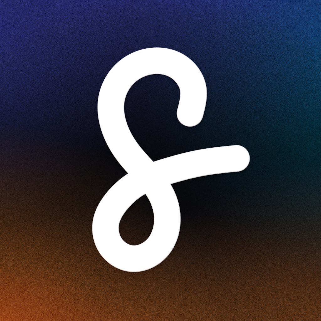
The S on the aurora, for wherever Scripe appears as a company with a picture: profile pictures, app listings, integrations and partner pages. The files are square and full-bleed, so LinkedIn, Slack or iOS can round or crop them themselves. The S sits safely inside a circle.
Colours
The logo and the mark only ever come in Ink or Paper. Accent is for buttons and links, and the four aurora colours paint the app icon’s field and the website’s backgrounds. Colour goes around the logo, never into it.
Need a format that isn’t here, or want to check a use before it goes out? Get in touch.